Users can create, edit, view and export various chart options based on a selection in IntraMaps.
Note: Charting functionality must be enabled by an administrator.
|
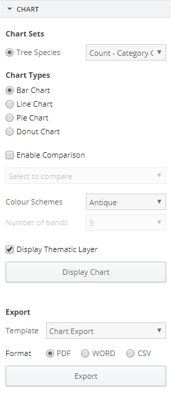
Charts Panel
|
A number of options can be configured for the Chart functionality:
- Using a Selection tool or search, select the desired features to create a chart from. Users must select more than one feature from the same layer to create a Chart
- The Chart Panel will automatically display in the Sidebar
- Select the Chart Type: Bar, Line, Pie or Donut
- If configured, users may be able to compare the data to another dataset. Enable the check-box and select the dataset to be compared with the current data
- Select a colour scheme
- Select the number of bands. The lower the number, the larger the value range per band
- Click Display Chart
- Note: The maximum number of categories that can be displayed is 10. If there are more, users will have an 'Other' category
- A window with the chart will display. Users can change any of the above parameters and their chart will update accordingly
- Click Display Thematic Layer. The features selected on the map will be coloured according to the chart colours
- To export, choose a Template and Format and click Export
If users would like a particular layer to be available for charting, or if an Export Template needs updating, contact an administrator.
|
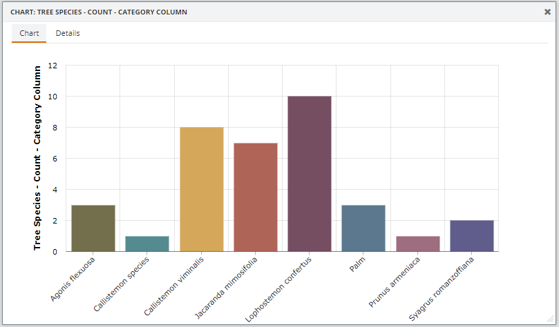
Chart Display
|
From the Chart display, users can click a column to view the attribute information for the features in that column. This will open up a new tab called Details.
When clicking a column, the features in that column become temporarily highlighted on the map in the background as a visual aid to display which features are included within that particular column.
Changes made in the Charts Panel will update the Chart Display accordingly.
|